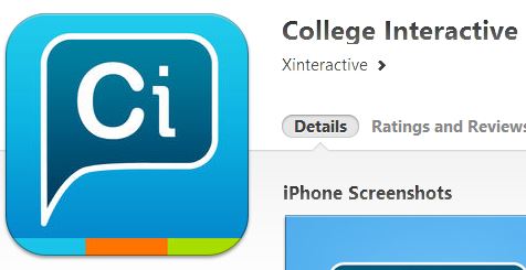
Xinteractive’s College Interactive App Icon is a colorful eye-fest, yet its US TM application is grey-scale blandness. This is not a bad idea at all, should its owner, Xinteractive, decide to change up the color scheme further down the line, or if a competitor decides to substantially copy the Icon with a different color scheme.
This further bolsters the viewpoint that a black and white TM will cover any color scheme combinations, within reason.


